Zone (AI Assistant)
This page provides information about the Zone Widget (available in AI Assistant Apps), which allows you to organize and structure your app’s layout by grouping widgets into distinct sections. By default, whenever you add any widget to the canvas, it is automatically placed inside a Zone Widget to keep your layout organized.

Content properties
These properties are customizable options present in the property pane of the widget, allowing users to modify the widget according to their preferences.
Section Split string
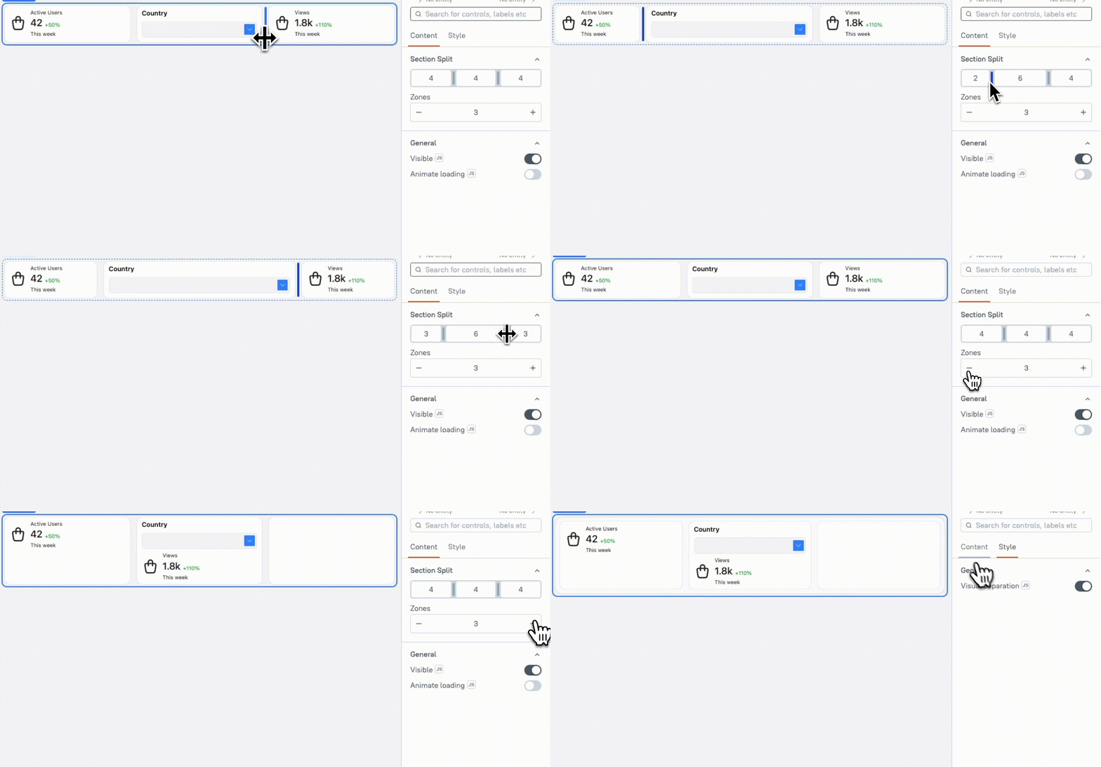
The Section Split property allows you to divide the Zone into four separate sections. Each section acts like a container for other widgets, and you can adjust how wide or narrow each section is by changing the number of columns it occupies, ranging from 2 to 12 columns. You can resize sections by dragging the section divider.
Columns represent the space available inside each section. The total space in the Zone is always 12 columns. For example, if one section occupies 4 columns, the remaining 8 columns are automatically distributed among the other sections.
Example: If you want to create a layout with a small button section and a large Table section, you can divide the Zone into two sections:
- Section 1: 2 columns wide, suitable for small widgets like buttons.
- Section 2: 10 columns wide, ideal for larger widgets like Tables or Forms.
Zone string
The Zone property defines the number of sections in your layout. You can have a minimum of one section and a maximum of four sections within a single layout.
General
General properties are essential configurations that provide overall control over the widget's behavior and appearance.
Visible boolean
Controls the visibility of the widget. If you turn off this property, the widget is not visible in View Mode. Additionally, you can use JavaScript by clicking on JS next to the Visible property to control the widget's visibility conditionally.
For example, if you want to make the widget visible only when the user selects "Yes" from a Select widget, you can use the following JavaScript expression:
{{Select1.selectedOptionValue === "Yes"}}
Animate Loading boolean
This property controls whether the widget is displayed with a loading animation. When enabled, the widget shows a skeletal animation during the loading process. Additionally, you can control it through JavaScript by clicking on the JS next to the property.
Style properties
Style properties allow you to change the look and feel of the widget.
General
General properties are essential configurations that provide overall control over the widget's behavior and appearance.
Visual Separation boolean
Controls the visual distinction of the section by adding an elevated background and/or borders. This property helps to visually separate the section from other sections, making it easier for users to distinguish between different content areas on the page.
Reference properties�
These properties are not available in the property pane, but can be accessed using the dot operator in other widgets or JavaScript functions.
isVisible boolean
The isVisible property reflects the state of the widget's Visible setting. It is represented by a boolean value, where true indicates that the widget is visible, and false indicates that it is hidden or not displayed on the page.
Methods
Widget property setters enable you to modify the values of widget properties at runtime, eliminating the need to manually update properties in the editor.
These methods are asynchronous and return a Promise. You can use the .then() block to ensure execution and sequencing of subsequent lines of code in Appsmith.
setVisibility (param: boolean): Promise
This allows you to change the visibility of a Zone based on conditions or user interactions within JS.
Example:
Zone.setVisibility(true) // Shows the Zone