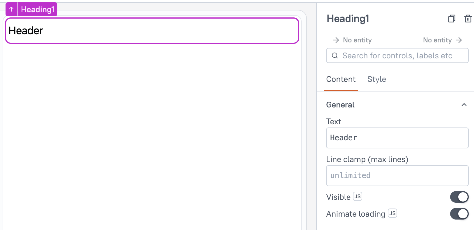
Heading (AI Assistant)
This page provides information on using the Heading Widget (available in AI Assistant Apps), which allows you to set and style text for creating titles, subtitles, and headers, helping organize content and enhance readability.

Content properties
These properties are customizable options present in the property pane of the widget, allowing users to modify the widget according to their preferences.
General
General properties are essential configurations that provide overall control over the widget's behavior and appearance.
Text string
Sets the text to be displayed. The text remains unchanged until manually updated or edited.
You can dynamically change text by fetching data from queries or JS functions and binding the response to the Text property. For instance, when a row in a Table widget is clicked, the Text dynamically displays the specific name associated with that row.
Example:
{{userTable.selectedRow.name}}
Line clamp number
The Line Clamp property specifies the maximum number of lines to display for a text element. Any content exceeding the defined limit is truncated and represented with an ellipsis. When no value is specified, the text automatically adjusts to multiple lines based on its length.
Visible boolean
Controls the visibility of the widget. If you turn off this property, the widget is not visible in View Mode. Additionally, you can use JavaScript by clicking on JS next to the Visible property to control the widget's visibility conditionally.
For example, if you want to make the widget visible only when the user selects "Yes" from a Select widget, you can use the following JavaScript expression:
{{Select1.selectedOptionValue === "Yes"}}
Animate Loading boolean
This property controls whether the widget is displayed with a loading animation. When enabled, the widget shows a skeletal animation during the loading process. Additionally, you can control it through JavaScript by clicking on the JS next to the property.
Style properties
Style properties allow you to change the look and feel of the widget.
General
General properties are essential configurations that provide overall control over the widget's behavior and appearance.
Font size string
The Font Size property controls the size of the text, with predefined options including Heading, Title, Subtitle, and Body. Heading is the largest, followed by Title, Subtitle, and Body as the smallest. You can enable JS to dynamically set the Font Size, allowing it to change based on specific conditions or user interactions.
By default, the size is set to Heading.
Text formatting
The Text Formatting properties allow you to customize the appearance of the text in the Widget.
Alignment string
Sets the horizontal alignment of the text within the cells.
Options:
- Left
- Center
- Right
Emphasis String
Allows you to choose a font style for the widget, including options like bold or italic. When JS is enabled, you can dynamically modify the font style using JavaScript functions.
Reference properties
Reference properties are properties that are not available in the property pane but can be accessed using the dot operator in other widgets or JavaScript functions. They provide additional information or allow interaction with the widget programmatically. For instance, to get the visibility status, you can use Heading1.isVisible.
text string
The text property retrieves the current text value of the widget.
Example:
{{Heading1.text}}
isVisible boolean
Reflects whether the widget is visible or not.
Example:
{{Heading1.isVisible}}
Methods
Widget property setters enable you to modify the values of widget properties at runtime, eliminating the need to manually update properties in the editor.
These methods are asynchronous and return a Promise. You can use the .then() block to ensure execution and sequencing of subsequent lines of code in Appsmith.
setVisibility (param: boolean): Promise
Sets the visibility of the widget. This method allows you to show or hide a widget based on certain conditions or user interactions.
Example:
Heading1.setVisibility(true) // Makes the Heading widget visible
setRequired (param: boolean): Promise
Sets whether the widget is required or not. This method is typically used for form elements where user input is mandatory.
Example:
Heading1.setRequired(true) // Marks the Heading widget as required
setText (param: string): Promise
Sets the text value of the widget. You can dynamically change the text content of the widget at runtime.
Example:
Heading1.setText('Welcome to the Dashboard!') // Updates the Heading widget text